WELCOME TO MY BLOG!

This is going to be my research blog, my inspirational blog and well, just about everything blog! Design Theory In Jewellery....

Thursday, February 24, 2011

Our Visit to the Michael Stevenson Art Gallery

Yesterday, we visited the Michael Stevenson Gallery in Cape town to see the installations and artworks by two South Africa Artists Daniel Naude and Wim Botha.

Both artists works were fascinating and beautiful! They were so simple in idea, but made you think about the deeper meaning of each piece, and how much time it took to produce them. I truly enjoyed looking at the works, they were very interesting and meaning full. It was an honor to be able to be able to draw and sketch in the gallery surrounded by such stunning inspirational installations!


The photographs taken by Daniel Naude captivated the relationship between South African farmers and there animals. On his journey around Africa's farmlands he spoke to the people he met, and started to appreciate the bond between man and animal which I truly think he emphasises in his photos.

He photographs the animals in a way that makes them stand out from the background, making them the main feature of the photo makes you really look, not just glance.


In this image "Xhosa cattle on the shore" is a beautifully calm and tranquil photo. With the gentle mist in the background its easy on the eye, and the cattle looked relaxed.


In this image "David Tieties with his 3 day old donkey" for me evokes a wonderful sense of bond and love for his animal. The gentle shadows compliment the figure without making him fade into the background.

---------------------------------------------------------------------------------------------------

The next artist who was displaying was Wim Botha. His exhibition consisted of multi-media sculpture using books, wood and polystyrene.


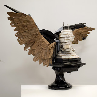
In this work "untitled" he uses books bolted together as a base, and then sculpts his work like clay! They are fascinating to look at, they give such an eerie feeling about them. They almost have a very dream like sense about them, a combination of the human form together with wings makes you think. Theres also this amazing sense of movement even though there still installations, maybe because of the lines through the books and the way the wings have been layered but it puzzles me, and it makes me like this piece even more!

My experience at the gallery was brilliant, and one I would love to experience again.

Thursday, February 17, 2011

Gestalt Theory In Jewellery Design:

Gestalt (translated as Unifed Whole) is a theory in which a group German scientists believed that the mind has self organising tendencies, especially when it comes to visual stimuli, meaning our mind automatically fills in the gaps, or brings lines together into something we comprehend or can make sense out of. These theories attempt to describe how people tend to organize visual elements into groups or unified wholes when certain principles are applied.

They are broken down into 6 principles:
  • Symmetry
  • Closure
  • Figure & Ground
  • Proximity
  • Similarity
  • Continuity
Each of these principles breaks down how the human mind comprehends items through looking at something. It seems almost to be something done in the subconscious as we as human beings look upon everything in the same way. We don't look at something in a pattern and describe it huge amounts of detail, we look upon an item and if something is grouped together we would try and give it shape (without even thinking about it)
Gestalt principes are the biggest tool in the designing world, they can be used for all aspects of design, be it jewellery, advertising, signage, etc. Each principle can be used in unison with each other to create a better layout!


You'll see in my examples that sometimes, an image/example can display more than one Gestalt theory. This can be overwhelming to try and figure out sometimes, but the more and more I look at items of inspiration, it now comes to me...how bigger part these elements are in design....Its brilliant!!!

Below is examples of the Gestalt principles in both general design and jewellery design, and how its been used and can still be used in design today.

Gestalt Theory - Continuity

Continuity - Is when the mind continues visual, auditory, and kinetic patterns, our mind tends to continue shapes beyond their ending in order to make something easier to identify with.

(The tub, 1886)
Continuity in art as well as jewellery is a key part in design. For example, this painting by Edgar Degas  would not be as aesthetically pleasing to the eye if not for continuity. The strong line from the shelf to the right distorts the roundness of the tub, but the artist has used the curve of the woman's back to almost bring you eyes full circle round the picture.


This bangle even though it looks like multiple bangles it actually one, but the sense of continuity makes the eye look round to see if we can make out all the circles. This bangle is also shows the principle of figure and ground.


This necklace is a fun example of continuity. The scissors make your eye continue around the necklace, and the dotted lines also assists with this.


This brooch is my favourite example of continuity, its made of 4 silver squares with slate. The 4 separate brooches when slanted make what appears to look like a mountain side. These brooches also illustrate the theory of Closure.
This chair because of it being a hollow construction and its use of lines is a clear example of continuity as it draws the eye down through the chair. (Can't say I'd like to sit on it though)


Human Tree Necklace, by Hanna Hedman

Gestalt Theory - Similarity

Similarity - the mind groups similar elements into collective entities or totalities. This similarity can depend on many different factors including, shape, colour, tone, texture etc


The image's shown here are examples of similarity, shown below is of a group of blue squares and circles, when we look at the image we see the triangle made up of circles. Because they are similar/identical in shape our mind brings them together. The same occurs when looking at the left images of circle, a line being bigger than the other makes our eye focus on them apposed to the smaller circles. (The image's are also an example of Proximity)


This silver pendant has similar leaf shapes that make up its roundness of this pendant


The earrings about show similarity as they are both identical. But Similarity does not always mean this, it can be described as something imitating another or a resemblance.

Elfie Spiewack - Diamond Earrings
This image shows similarity in that both colour and shape, the green fish being dis-similar both because of its colour and direction.


Wednesday, February 16, 2011

Gestalt Theory - Proximty

Proximity - The concept of proximity is our mind bringing similar objects together into groups. When we see a number of objects close together, we tend to see them as forming a group unconsciously.

This image shows this principle in a basic way. The right hand side of the image we perceive as spots or circles in a random order, but the image to the left we interpret as a triangle, only because of the way in which there grouped together, there proximity to each other! 


The jewellery below is a fun example of what can be done with proximity in jewellery design. She has brought together pencils and shaped them into different designs. The item best showing the gestalt theory being the ring pendant (bottom right) 

Maria Cristina Bellucci
Pencil Jewellery


In this image, what do you see? A tree? A group of people?

Gestalt Theory - Symmetry/Asymmetry

Symmetry - The principle in Gestalt symmetry is the idea that when we look upon objects we tend to perceive them as symmetrical shapes that form around their center. Symmetry meaning that in our perception and in cases of mirror images most objects can be divided in two more or less symmetrical halves and when for example we see two unconnected elements that are symmetrical, we unconsciously bring them together to make a whole.


This image of an Anc cross, is an example of symmetry in jewellery. This pendant if split down the middle would be the same on both sides. Theres also something about the human mind that makes us "happier" about something being symmetrical. Its more aesthetically pleasing to look at compared to something that is busy and makes no sense. By making something symmetrical it somehow makes an item easier to understand, ie: most traffic signs are symmetrical so that with a glance something can be understood, a sign that is to busy is more likely to be missed or not interpreted.


One of the most famous images in design which uses the element of Symmetry is the "M" for Mac Donald's. 

The above image shows clearly a reflection in water, the waterline being the line of symmetry. Her necklace is also symmetrical.


A-symmetry
Below, some examples of asymmetry in jewellery.


All the above examples have similar aspects, but one thing has been altered to make them different, but still a pair! I love this aspect of design!!!

Monday, February 14, 2011

Gestalt Theory - Closure

Closure — The mind may experience elements it does not perceive through sensation, in order to complete a regular figure (that is, to increase regularity).
In this image we look at it and see a orb/circle covered in spikes like a mine.
Our mind finds it difficult not to see this, it tries to make sense of it by filling in the areas in which we think should be there.


In this image, we don't see a selection of circles and unfinished circles, our mind looks at the center of this image, and forms a square. This illustrates closure. 


This image of a friendship necklace shows the theory of closure, our mind brings the two halves together. 


And again in this image of the Unilever logo, out mind closes the objects edges to make the "U" but this images also shows the principles of proximity and similarity.


Gestalt Theory - Figure & Ground

Figure and Ground — Similar elements (figure) are contrasted with dissimilar elements (ground) to give the impression of a whole.


This classic example shows figure and ground very clearly. Everyone looks at this image differently, is it two faces of a vase? It depends on which colour your focusing on as to what you interpret.


The Danish psychologist Edgar Ruben made faces alternate with vases in fascinating ways

This example of Art by my favorite artist M C Escher (who was a genius when it came to figure and ground principles in art) He uses the same principle as the first picture, but in this instance, the fore ground and background changes depending on what colour you focus on. Be it the black or the white. For me the white is the most prominent, being a lighter colour, it always jumps forward. Pure GENIUS!


These earrings by Jasmine Watson (jewellery designer for Lord of the Rings) uses a simple two layer effect to show figure and ground. The flowers standing out through the back colour. 

This last image uses the basic idea of figure and ground by using black on a transparent acrylic base. 


I Just thought this was beautifully simple, but brilliant example.